Class Course Enrollment
Education
UX Design
A High-fidelity redesign of the Campus Connect enrollment page for college students
Brief Overview
Campus Connect is a website students in Illinois use to search, enroll, and drop classes. It is the main management system they use to plan their college career and the interface has not changed since 2011.
Preparation
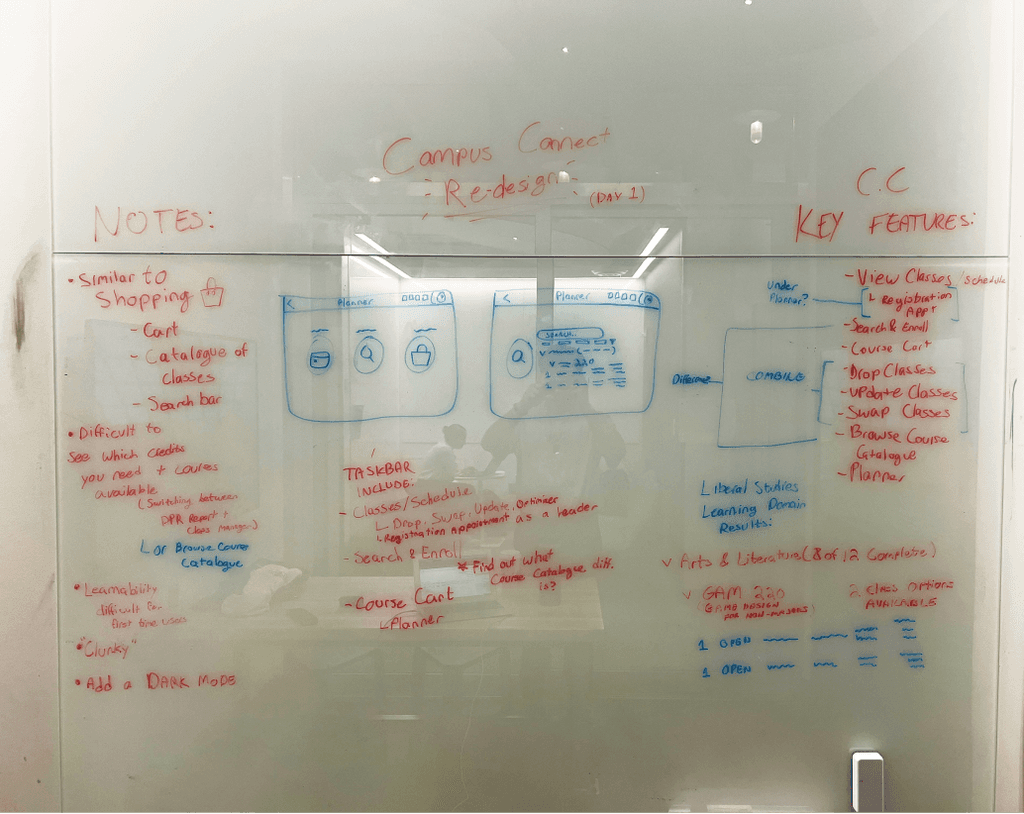
Before doing anything, I first examined the current layout of the website, discerning what features were necessary versus what I could potentially condense.
The main priorities lied in the ability to manage your classes while knowing which requirements you need to fulfill which enrolling for courses.
A Close Examination
After evaluating the interface, the pain points often occured in areas when it came to managing and enrolling in classes.
Knowing which classes you needed to enroll in to to fill up a requirement required opening up an additional tab with your student progress.


Minimizing the Clutter
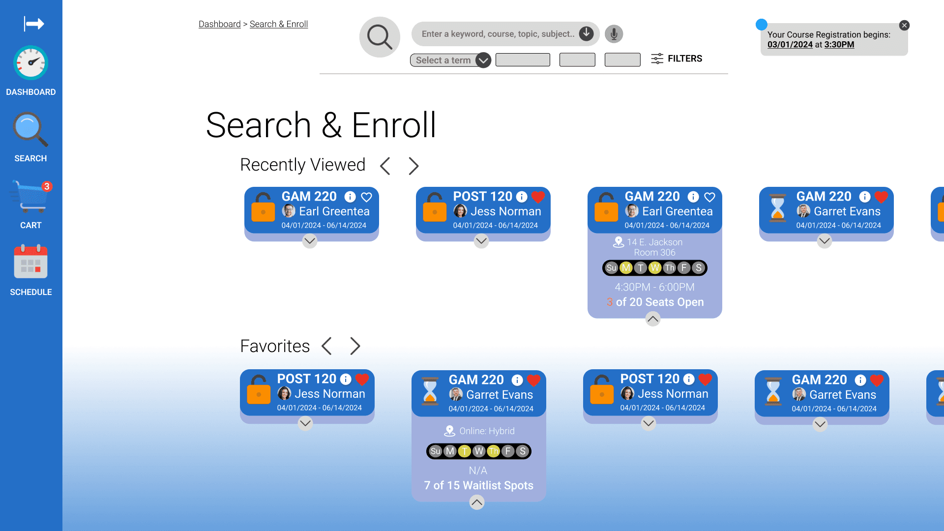
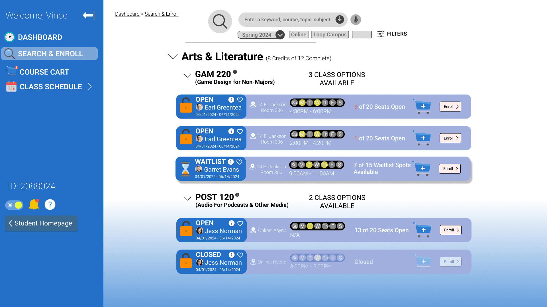
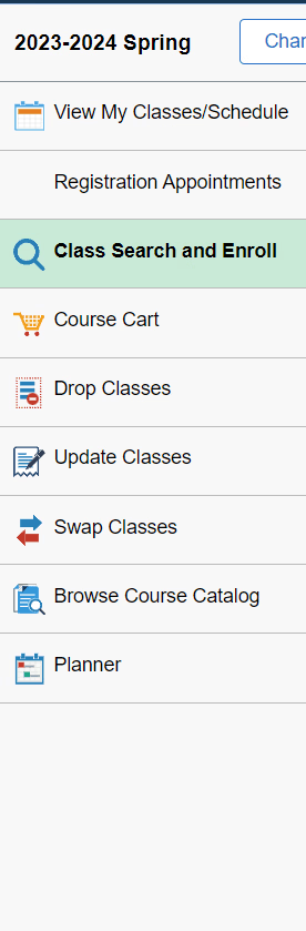
Pages such as Drop, Update, and Swap Classes could be condensed into one single page, while others such as Search & Enroll, Course Cart, and Planner should be kept seperate.
Additionally, some icons were often unclear and at a glance unknowing what some did when pressed.


Wireframes & Prototyping
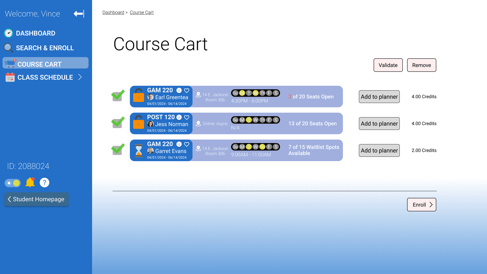
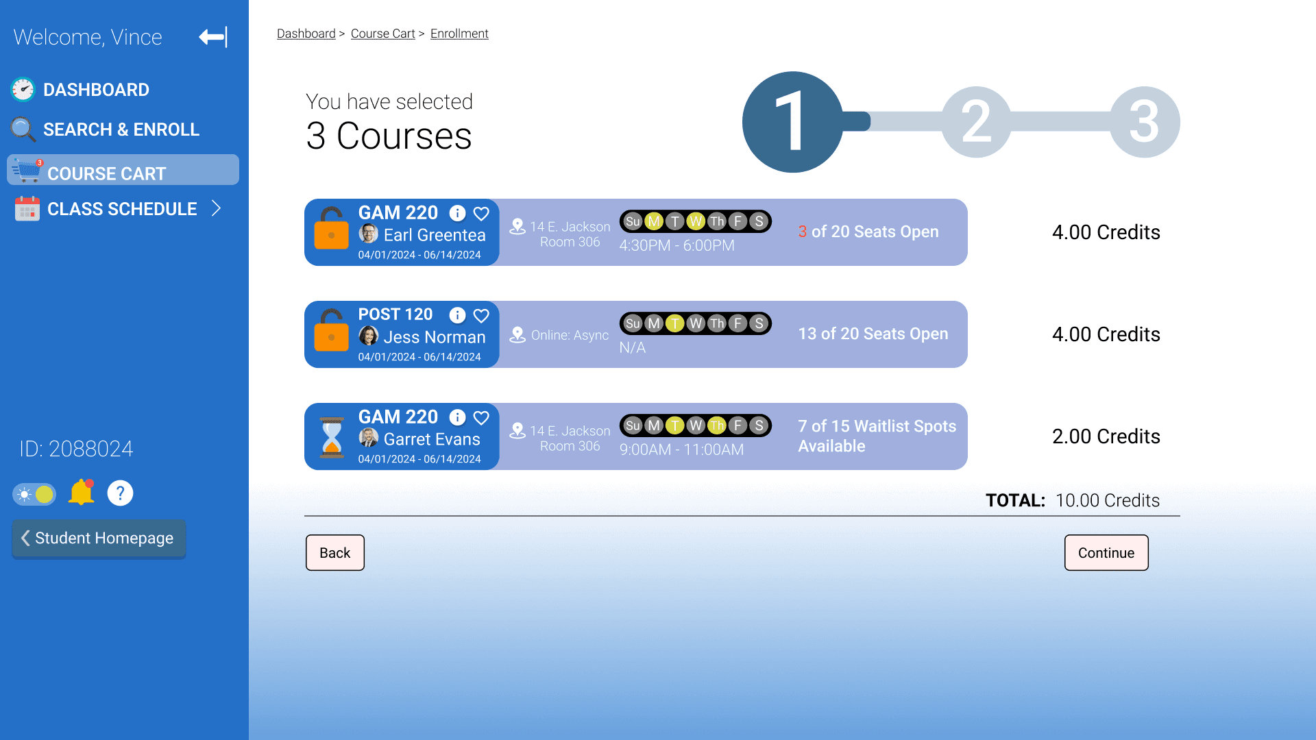
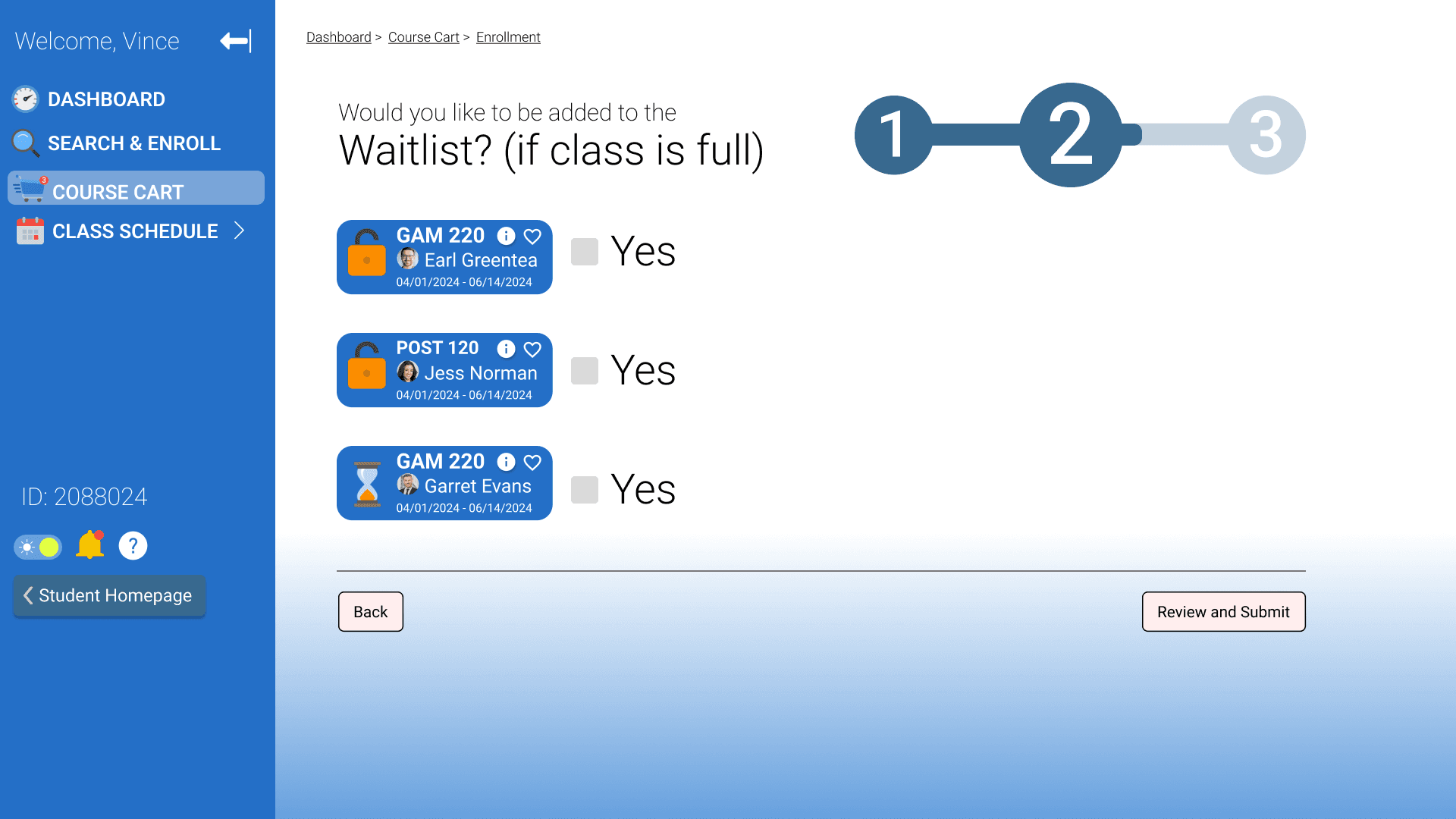
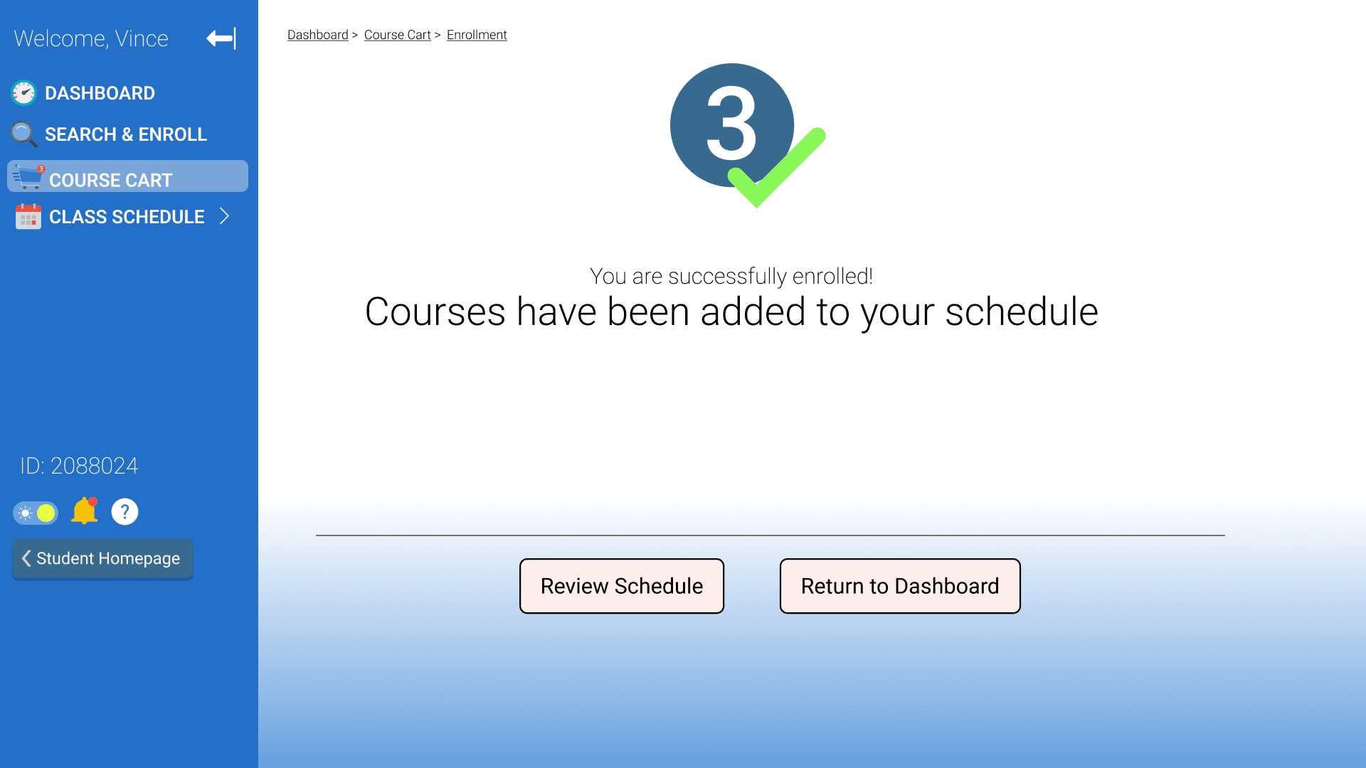
My priorities lied in making the class enrollment process easier for students.
I discerned that searching for classes, managing them, and visualizing them within ones schedule should be made much more apparant.
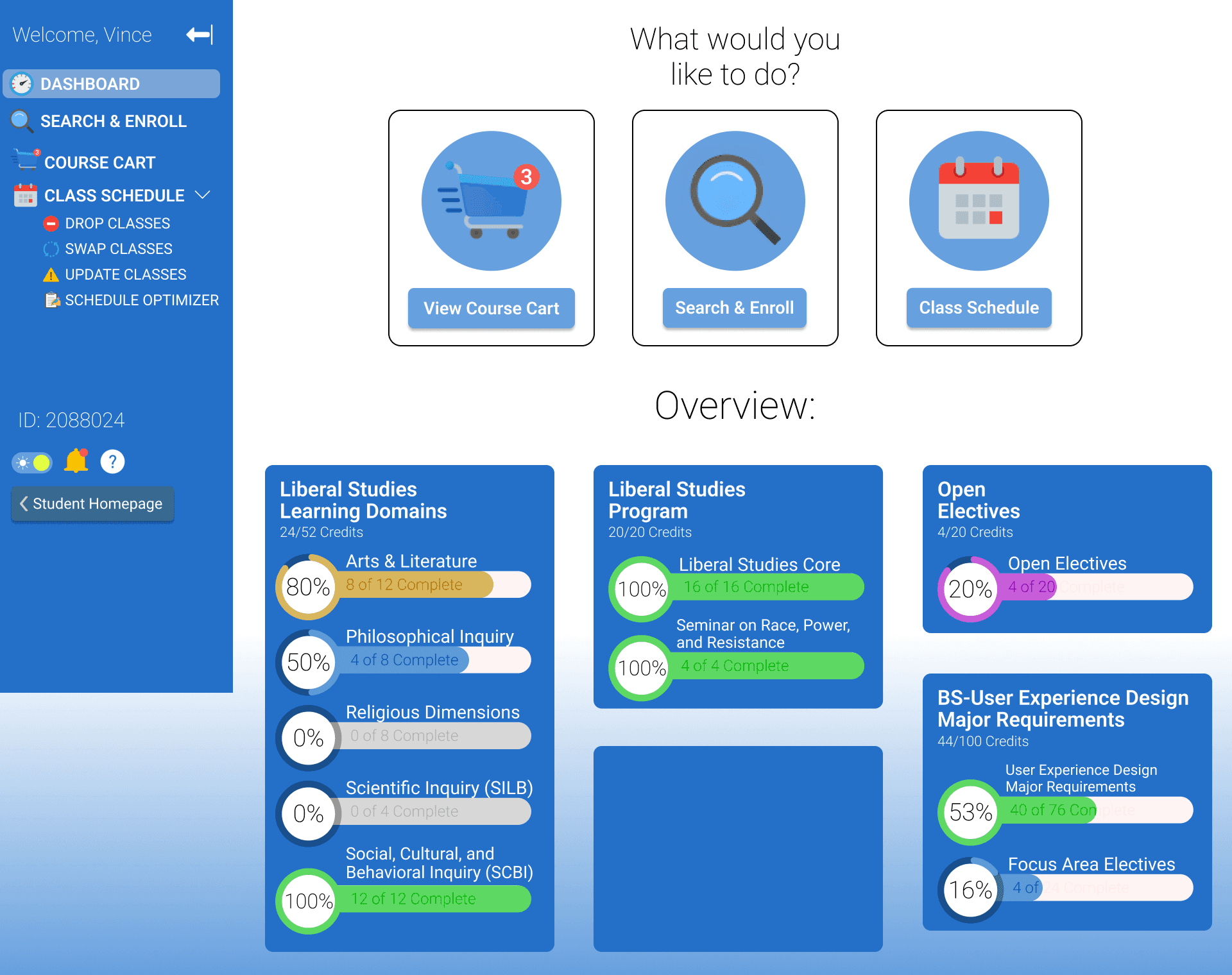
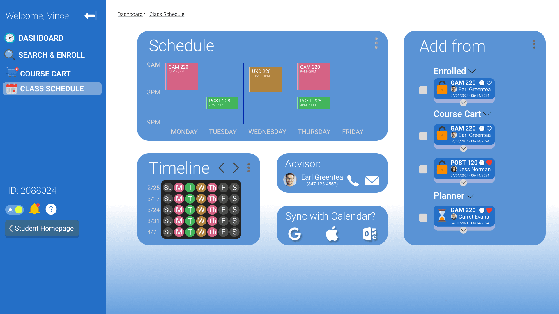
Additionally, why not give students the option to view their requirements without needing to visit a whole different modular? Thus I implemented a class schedule.
Final Prototype
My priorities lied in making the class enrollment process easier for students.
I discerned that searching for classes, managing them, and visualizing them within ones schedule should be made much more apparant.
Additionally, why not give students the option to view their requirements without needing to visit a whole different modular? Thus I implemented a class schedule.